More readable tests with Kotlin
FlavioMore readable tests with Kotlin
The following is a highly opinionated rant. These are just my personal views on a subject I care about.
Tests should be easy to read. You should be able to go to a test class you are not familiar with, collapse all the methods, and have a very quick read of all the test names. You do that, and in a matter of seconds you should have a very good idea of what the system under test is expected to do and in what circumstances. If you can do this then what they say about tests, that they serve as living documentation, becomes more true than ever.
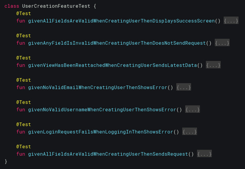
Now here’s what a BDD-style given-when-then format I’ve seen used and have used myself in the past looks like:
 Given when then tests
It’s not exactly a pleasure to read a screen full of this stuff is it? The given-when-then keywords take up precious space on the screen. I really don’t want to read a screen full of this stuff, because after a while it sort of starts looking a bit like:
@Test
fun blahblahIHopeTheyPayMeThisMonthBlahblahBlahblahBlahblah() { ... }

@Test
fun blahblahBlahblahIHateMyLifeBlahblahBlahblahBlahblahBlahBlahBlah() { ... }

@Test
fun blahblahBlahblahBlahblahBlahIWantToGoHomeAndCryBlahblahBlahBlahBlah() { ... }
at which point I might well be tempted to uncollapse the methods and just read the test code, and bam! my reading speed and information retention just plummeted. Not what I wanted.
Well, that’s one way of doing it, but there are others. Roy Osherove suggests something like the following format instead:
@Test
fun createUser_WithAllFieldsValid_DisplaysSuccessScreen() { ... }

@Test
fun createUser_WithAnyInvalidField_DoesNotSendRequest() { ... }
I’ve used that for a while, it was neat and I liked it. It still has a clear structure, and it gets rid of the formulaic keywords given-when-then while achieving a very similar result. Nice, but in my humble opinion it still has a little bit of a flaw. It reads like it was meant to be read by a robot, not a human. Also it’s pretty much inevitable that eventually you run on problems expressing your intention behind what you are trying to test when using this format. Or maybe it’s just me.
So here’s an alternative approach I prefer using at the moment, which I think I learnt from @mvarnagiris :
@Test
fun displaysSuccessScreenWhenCreatingAUserWithAllFieldsValid() { ... }

@Test
fun doesNotSendRequestWhenCreatingAUserWithAnyFieldInvalid() { ... }
I think it reads more like what you would actually say when asked “what does this system do?” by a colleague or manager. You lose the nice structure of the other formats, but hey, I don’t see many people explaining their product owner or colleague what they just did by speaking like a robot.
But wait what’s that? Oh look! It’s the good old blahblahBlahblahBlahblahIsIt530YetBlahblahBlahblah() effect again!
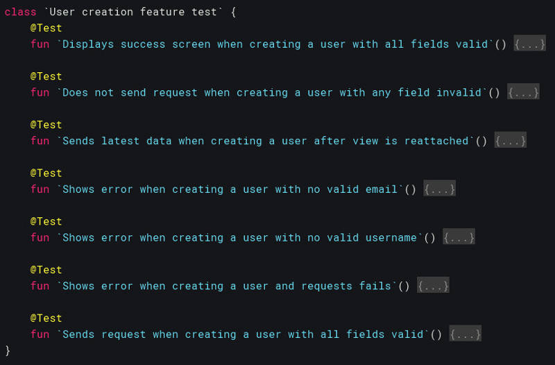
Now, it’s Kotlin we’re using, so let’s use the `` thingy Kotlin offers, I say. Feel free to use them in your test methods, or even class names, and feel free to write your test names in a as readable and as descriptive a way as you can. This is what I’d rather see:
 Human readable tests
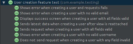
Now I can read a whole page of this stuff, quickly and without getting tired. What’s more, I can actually read the summaries of the tests that have run at the bottom of the screen and actually get some more info out of it more than that all my givenBlahblahCoolStoryBroBlahblahs are green, whatever they mean. What summary would you rather read?
Wall of text meant for robots:

Information meant for humans:

I for one would definitely go for the second one. But that’s only my fallible opinion anyway, what do YOU think? n